Is your website struggling to turn site visitors into leads?
I’ve been there.
I’d done everything by the book: I put helpful content out there, targeted at my Dream Customers. Once warmed up and familiar with my brand, I used paid advertising to drive people to a landing page where they could enter their name and email for a free consultation.
Very few leads trickled in off the back of this, and I felt pretty deflated.
My conversion rate of site visitors leads more than doubled with this new landing page.
Testing a hybrid blend of Ryan Levesque and Russel Brunson’s landing pages
I reviewed the heatmap and recording sessions of my landing page, and people were browsing through the page – just nobody put their details in before they got distracted and clicked elsewhere on my website or away from it altogether.
Determined, I studied what the best in the business of landing pages were doing. People like Ryan Levesque and Russel Brunson had excellent guides on building landing pages that convert.
Even better, their guides mostly agreed on what the landing page should look like, and they practiced what they preach with their own websites.
So I went to work, merged their (very similar) landing page guides, and tested this new hybrid version.
My conversion rate of site visitors to leads more than doubled with this new landing page. It’s now the standard format we use for our clients.
I’d like to first share the three main principles of a landing page that converts, and then actually share the template with you that we follow so you don’t have to go and do the research yourself.
Please note that these same principles apply whether you are trying to get the prospect to download a resource or take a quiz that you have created, book a free demo or an initial consultation.
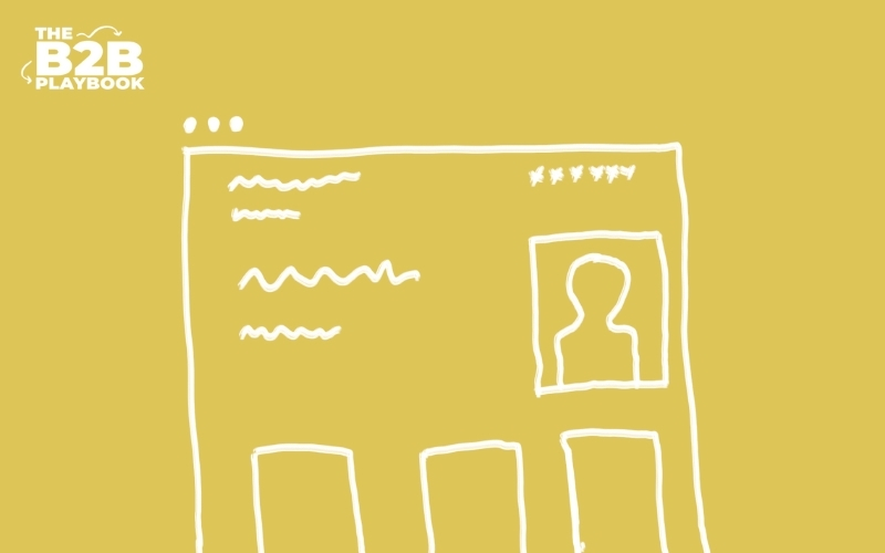
Principle One: Make Your Trust Signals Obvious
People won’t give you their details if they don’t trust you. They also won’t go digging through your website to decide whether or not they should trust you.
When they land on your page, you need to make them feel safe and secure without them having to scroll.
How do you do that? Above the fold on your landing page, make sure you include:
- Your logo, so they know they are dealing with you
- Your phone number and possible your address to show you are an established business
- Important credentials and awards that position your business as an expert
- A picture of your ‘authority’, to give your potential customers confidence that you are a real person with a real business
Principle Two: Focus On The Benefits, But Leave Some Room For Curiosity
In your headline you should describe the main benefit to the prospect by taking the action you want, but leave some room for curiosity. An example could be: “You’re About To Learn How To Save Time In Ways That Most People Never Discover..”
Throughout the page you should state numerous times what benefit they will get by taking your quiz, or downloading your resource, or booking their consultation with you. You could include 3-5 bullet points on what your resource will help them learn, and how they will benefit from it.
Provoke further curiosity by telling them what you will help them discover.
Principle Three: Don’t Give People An Opportunity To Get Distracted
This was one of my biggest mistakes! Don’t let the prospect get distracted.
Have big call-to-actions like ‘Download Now’ throughout the page. These should be the only buttons on the page. This is no place to link to your blog, or get people to subscribe to your email list (unless that’s the sole focus of the landing page).
You should aim to reduce any links away from the page. You can even go as far as removing your usual header and footer from this page.
The only link, and the only buttons, should be the one that gets the user to take the action you want on this landing page.